


Love colour but scared of going overboard? We asked an expert all our burning questions about how to add colour to the home – the right way!

Toni Newman is the founder of Toni + Co, a Melbourne-based interior design, decorating and styling studio that helps clients create homes and spaces that are beautiful, cohesive and functional.
What’s the easiest way to start adding colour to a neutral home?
Bit by bit. If you are redecorating, start simple by adding greenery or flowers – they will make a huge impact.
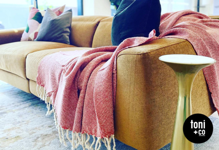
Think about cushions and throws; adding these is another inexpensive way to add (and change) colour without replacing large items of furniture too often, as that can get expensive.
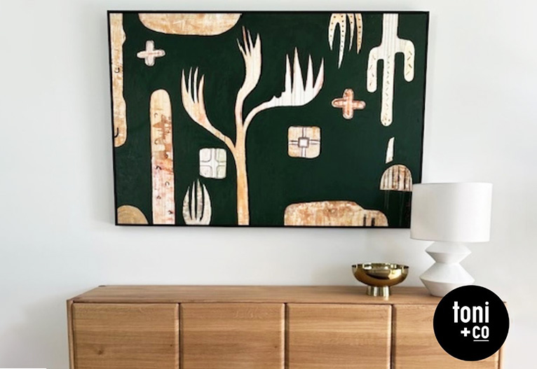
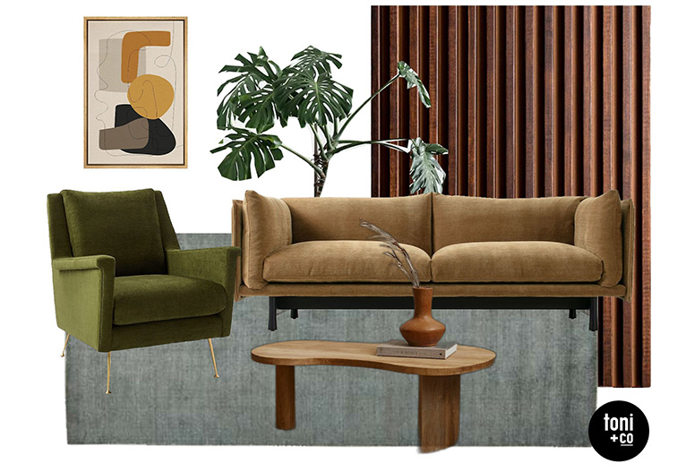
Artwork, too, not only injects a point of interest and adds personality, but can bring with it as little or as much colour as you can handle.
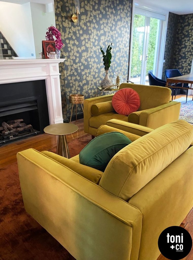
As you start feeling a little bolder, and if you have the budget, you could think about re-covering existing furniture or purchasing new pieces in different colours.
In the correct size, rugs in one colour can help infuse colour to a neutral space. Adding to that, a pattern or design can amp up the vibe and aesthetic of a room, too.
We LOVE paint and wallpaper, and although a little more time and effort may be required, the difference that even just one painted or wallpapered wall can make is huge. Start with a more muted colour if you need to.
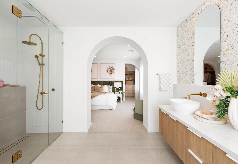
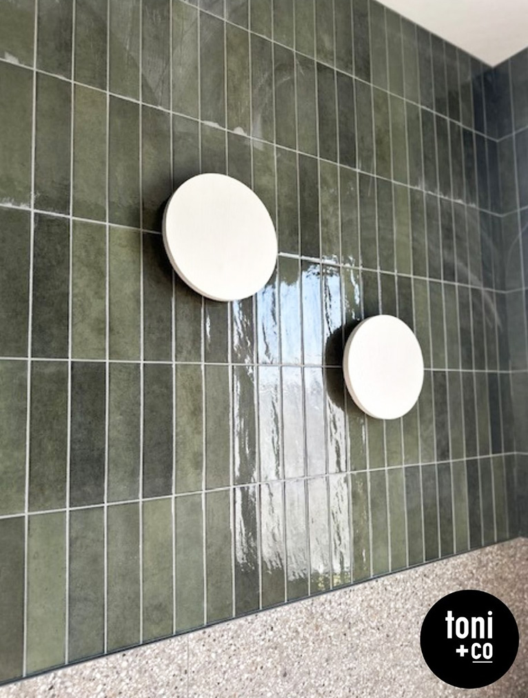
If you are looking to incorporate colour into a new build or renovation but don’t want to go overboard, consider subtle inclusions such as adding a muted feature tile to complement mainly neutral coloured tiles in a bathroom or powder room. Or perhaps a subtle stone splashback with ‘veins’ or ‘splashes’ of colour.
How do you choose a colour palette that feels cohesive?
We always work up a mood board first, because to ensure a cohesive look, you should have an understanding of the overarching style and mood you want to create.
Ask yourself what your floors, walls and cabinetry are going to look like together. What style is the furniture? Are you incorporating existing pieces? Do you know what decorating pieces you’ll be using? Once you have built this foundation, then assess if it NEEDS colour. If you think so, start by adding colours to your mood board slowly at first if you are unsure. Start with a single colour, then add variations of that colour. You don’t necessarily have to pick an opposing colour straight up or at all.
Keep in mind that ‘adding colour’ doesn’t necessarily mean bright, vibrant or fluorescent colours. Adding colour can also be about adding muted shades, as earthy tones can add colour too. Keep it simple with maybe one or two colours to start.
Are there ‘safe’ colours that tend to work well in most homes?
As every home differs in style, floors, walls and natural lighting aspects, it really depends on the space, style and materials that have already been selected.
However, if I had to pick one colour only, then green, in all of its magnificent hues and tones, would be it. It’s fabulous and stands the test of time. Green literally feels like nature, and it works across a plethora of styles, including mid-century, coastal art deco and more. And even when one green shade falls out of favour for a bit, another green shade inevitably takes its place.
Plants in a home never date. Always remember you can ‘double up’ and add depth or definition by adding a textured, coloured object.
How much colour is too much – is there a rule to follow?
I adore colour; it can lift your mood, completely change the ambience in a space, and when executed well and with consideration, the sky is the limit! So for me, there is no such thing as too much colour.
However, as always, know the look and feel you want to create first. Get your mood boards happening, adding, subtracting and adding before you purchase.
Should you match colours across rooms, or mix things up?
It depends on the project and how closed off or open each room is in relation to the next. We always work toward a cohesive look and feel with a lovely flow and sense of rhythm throughout, but Toni + Co will often change up colour palettes between rooms.
One way to ensure that an entire home doesn’t feel like a slapped-together mixture of clashing colours (unless THAT IS the look and feel you are after!) is to keep the flooring and the base colour of the walls and ceilings consistent, and flesh out the colours with that in mind.
Of course, you can pick up one colour in different tones and weave it throughout the home. Subtle nods can go a long way.
How can artwork or accessories help tie colours together?
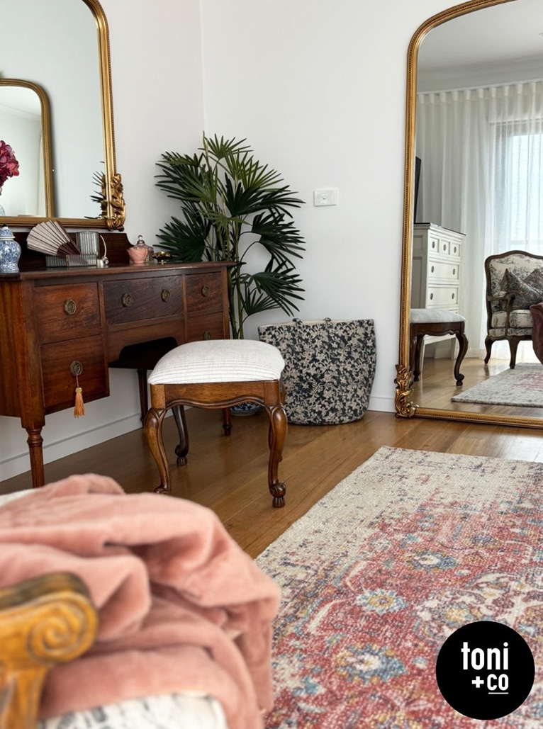
Adding art and/or accessories is a fabulous way to inject not only colour, but also personality into a space. This is one of Toni + Co’s signature moves, and we’ll often establish a colour palette around a piece of art or a rug. Then, you can pick up any of those colours in the cushions, throws and decorating items.
Think outside the square and add accents of gold, silver, bronze or copper to the colour palette. These are colours too, and a wonderful way to elevate a space.
Even mirror frames in different colours can inject colour, not to mention elevate rooms!
Is there a difference in how you approach colour for small and large spaces?
This really depends on the mood and style we are trying to create in that space. Darker colours will generally enclose a space and make it feel smaller. Lighter colours will open and brighten a space up.
Any final tips for people looking for their home’s new signature colour?
Gather visual references! Inspiration is everywhere: at the beach, in nature, flowers and clothes!
You don’t necessarily need to worry about focusing on trends. They are fleeting and cyclical. By all means, be aware of what trends are, but don’t be governed or restricted by them. There are no rules!
Start small with plants, flowers, cushions, throws or lamp shades, then maybe move on to paint, wallpaper, larger furniture and then more expensive and less easily changed options like cabinetry, tiles and stone.
Colour is never about all or nothing or going over the top with brightness. Even subtle shades of colour can make a difference. Don’t be scared to dip your toe in!
Do you have a go-to trick for adding a pop of colour in rooms? Share it with us below!
-

-
-
misha, VIC
- 14 Dec 2025
-

-
-
Mum4232, NSW
- 28 Nov 2025
-
-
-
TraceyGail, NSW
- 12 Nov 2025
-

-
-
MH514261, NSW
- 31 Oct 2025
-

-
-
MH513363, QLD
- 28 Oct 2025
-
-
-
ChiWren, QLD
- 22 Oct 2025
-

-
-
MH514261, NSW
- 19 Oct 2025
-

-
-
MH513376, WA
- 17 Oct 2025
-

-
-
sars_angelchik, TAS
- 16 Oct 2025
Post a commentTo post a review/comment please join us or login so we can allocate your points.