


Choosing the right interior paint can feel overwhelming, but it doesn’t have to be. A colour expert shares her go-to process for picking shades that always work.

As the colour and concept lead at Haymes Paint, Rachel is responsible for developing and executing the company’s colour and design direction. Rachel has a background in paint manufacturing, patenting of cutting-edge paint products, and colour consultancy and forecasting. She has more than 30 years of experience in the design and interiors space, and her knowledge and expertise have seen her work across New Zealand, Europe, the US, and the UK.
Start with the light, not the colour
Choosing the right paint colours for your home interiors doesn’t start with the colour at all.
Considering the light in the room you’re preparing to paint is a far better place to start than “what colour do I like” or “what’s on trend”.
The nature and quality of light in a room is a major factor in colour choice. Consider the aspect – north, south, east, or west. South-facing rooms often have a shadowiness, or a moody blue tinge, while a room looking out through trees may be tinged with blue-green.
Think about when the room is used most. What is the light like then? How does artificial light affect it? What type of artificial light? Incandescent light and flame are warm, adding a glow. Fluorescent light is cool and tinged with blue-green. Halogen light renders colour most accurately, but it can be very intense and may wash out your chosen hue.
Use colour to highlight favourite things
Colour should also be used as a link (or glue) to accentuate and complement your favourite things, creating an atmosphere where you feel most comfortable.
Trick the eye with paint
Colour can be used cleverly to correct proportions.
For example, a long, narrow room can be made to feel more balanced by using a strong, warm colour on the far walls, bringing them visually closer.
Or, if you have a small room with a high ceiling and want it to feel more spacious, consider using colour on the ceiling. This will visually lower the ceiling and give the impression of the walls moving outwards.
Play it safe with muted shades
If unsure about colours, look to more muted colours.
Softer colours are easier to live with, and the task feels less daunting when you’re considering sage greens versus stronger, more chromatic colours. For example, instead of choosing an attention-grabbing green like Spruce, consider Green Tiara or the slightly greener Foam Forest instead.
Try colour drenching
One way to simplify the process is to avoid bringing too many different colours into a room.
Colour drenching – where you paint walls, ceilings, and trim in the same colour – is a wonderful way to introduce colour without worrying about coordinating different coloured architectural elements.
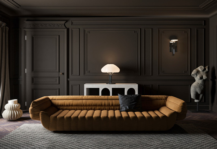
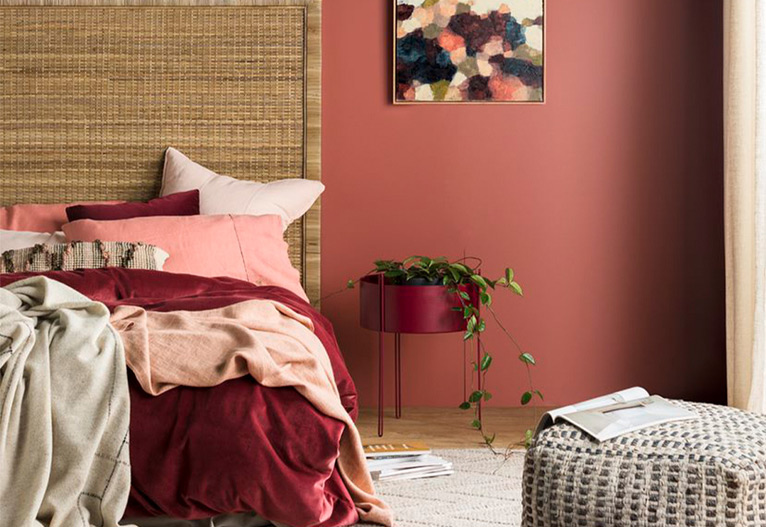
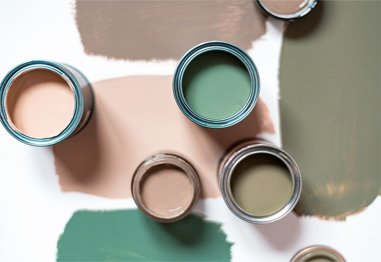
A strong but warm colour like Orange Lichen is wonderful for colour drenching. Or, to create a dark, moody space, try Parched Earth (pictured top).
Keep it simple with monochrome
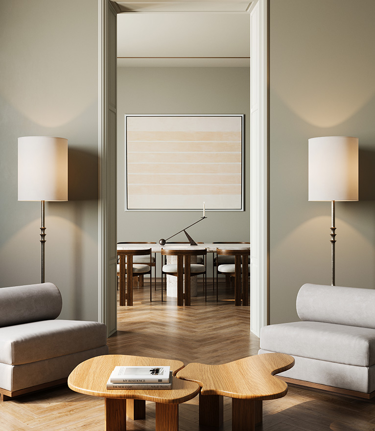
Another approach is a monochromatic colour scheme, which uses different strengths of the same colour: full-strength on the walls, quarter-strength on the ceiling, and half-strength on trims and doors.
This method introduces colour but avoids the stress of trying to bring too many different colours together. It also adds interest and layering to the space, without the visual “noise” of multiple competing colours.
While we see this applied in varying shades of white, stronger neutrals such as Intuition for walls paired with the lighter Quarry Stone for trims is a simple, elegant colour palette.
Always test your colours
Once you’ve considered each space and noted the light, you can experiment with your selected colours.
Sample pots are by far the best way to do this. Paint a small area of the wall that catches the light, then find a shadowed spot and paint a section there too. Watch how the colour changes across the day on sunny and cloudy days, and at night under artificial light.
If you have a couple of choices, try them both. Live with them for a few days and think about how they make you feel. If you trust your instincts and take your time, you will create a beautiful space.
Top image: Haymes Paint
What steps have you taken to choose interior paint colours? Leave us a comment below.
-

-
-
MH513900, NSW
- 27 Nov 2025
-
-
-
TraceyGail, NSW
- 17 Nov 2025
-

-
-
MH514261, NSW
- 27 Sep 2025
-

-
-
sars_angelchik, TAS
- 24 Sep 2025
-

-
-
Mum4232, NSW
- 05 Sep 2025
-

-
-
MH514261, NSW
- 30 Aug 2025
-

-
-
MH513900, NSW
- 30 Aug 2025
-

-
-
MH516778, QLD
- 23 Aug 2025
-

-
-
MH514261, NSW
- 22 Aug 2025
-

-
-
MH514138, WA
- 22 Aug 2025
-

-
-
sars_angelchik, TAS
- 21 Aug 2025
-

-
-
ChiWren, QLD
- 20 Aug 2025
-

-
-
MH513363, QLD
- 20 Aug 2025
-

-
-
MH513376, WA
- 20 Aug 2025
-

-
-
misha, VIC
- 19 Aug 2025
Post a commentTo post a review/comment please join us or login so we can allocate your points.